UC Berkeley logo (academic identity)
Primary logo
Inspired by famed type designer Frederic Goudy’s Californian typeface — which was created more than 85 years ago for the University of California Press — and its sibling font, Deepdene, our logo is designed to be clear, confident and curious. With its bold letterforms and upward-facing “e’s,” we are reminded of UC Berkeley’s mission as a public research university. The terminal at the end of the “y,” is a nod to the terminal in the “c” of the Cal script, and is designed to create a subtle, but important visual connection between the academic and athletic identities.
The new iteration of the typeface has evolved to perform better in digital spaces by lessening the contrast of the letterforms. This means that the difference between the thickest and thinnest parts of the characters has been reduced, resulting in better legibility.
The UC Berkeley logo should never be recreated or typeset. Only official logo files should be used in communications. The UC Berkeley logo serves as the campus’ primary logo and trademark. Other campus trademarks may appear on merchandise produced by vendors specifically licensed to reproduce these trademarks.
Expanded logo
The expanded logo can be used together with the primary logo when space permits and for external audiences who may be less familiar with UC Berkeley. For example, when producing a prospective student brochure for international students, the expanded logo can be used in relationship with the primary mark for additional context.
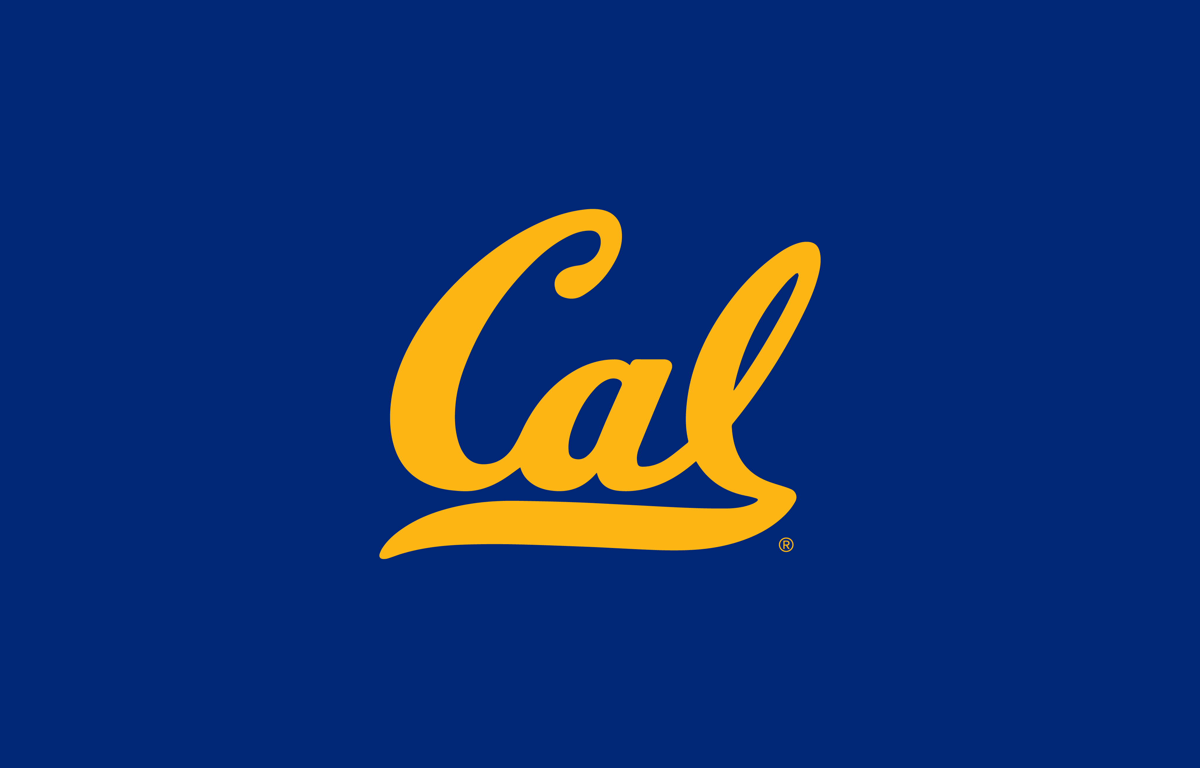
Cal (athletics identity)
Primary logo
In athletics contexts, the Cal and UC Berkeley logos may be used together at the discretion of Intercollegiate Athletics. In alumni contexts, the Cal and UC Berkeley logos may be used together with special permission from Communications & Public Affairs.
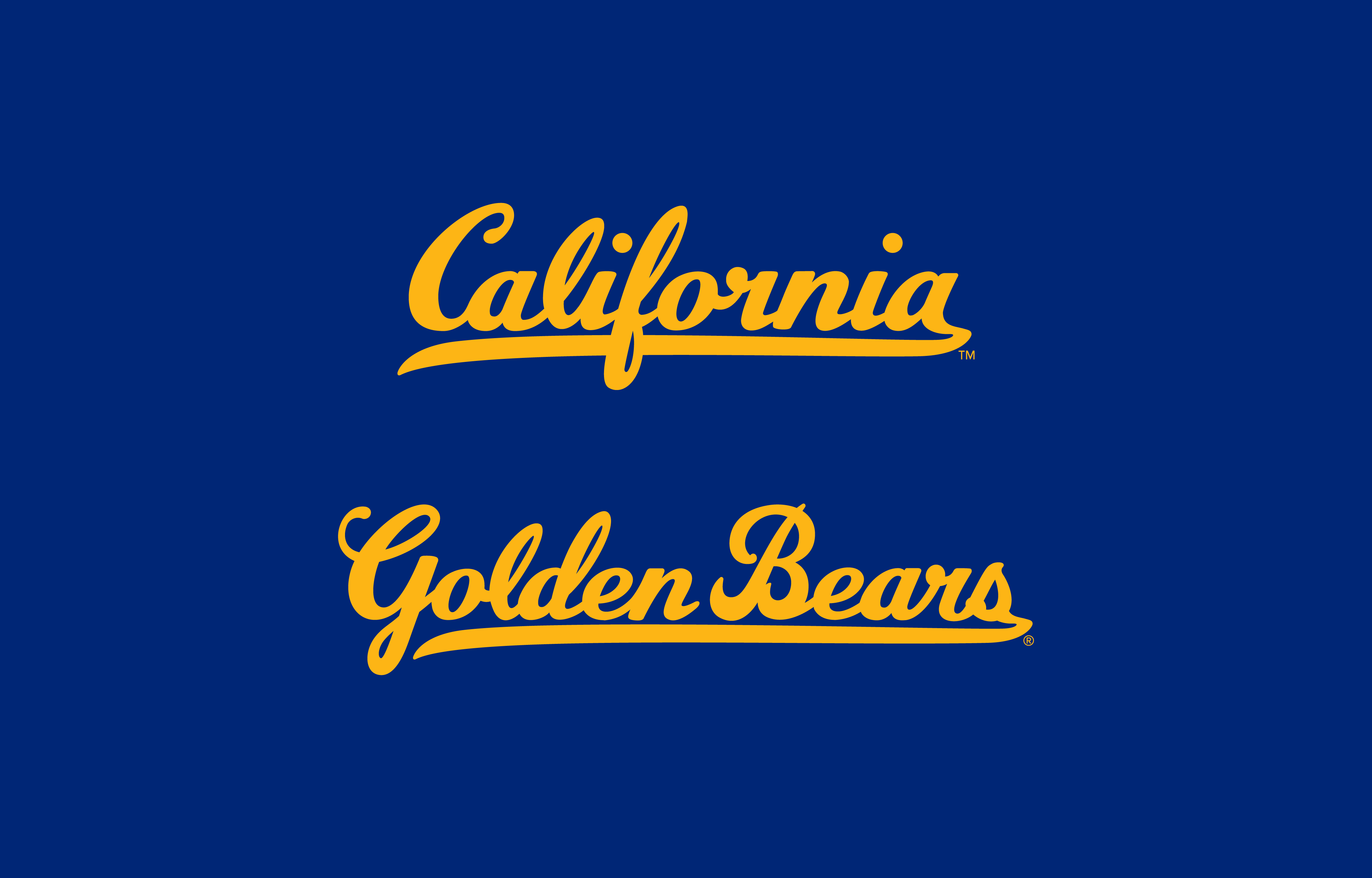
Secondary logotypes
In certain contexts, the California and Golden Bears logotype may be used. These are supporting elements and should never replace the primary Cal script mark. Additional brand elements include Oski the Bear, the “This is Bear Territory” rallying cry, the Sather Stripe, and sport and/or team-specific signatures. For additional information on the usage of the Cal script mark, secondary logotypes and supporting graphic elements, please contact Intercollegiate Athletics.
Logo variations
The logo may be issued only in the following color pairings.
One-color logo
The logo can appear in black only for black-and-white and grayscale scenarios.
Clear space
To ensure that clear space is maintained around the logo for legibility and prominence, photos, text and graphic elements must follow the guidelines illustrated here. Use the letter “e” as a measuring tool to help maintain clearance.


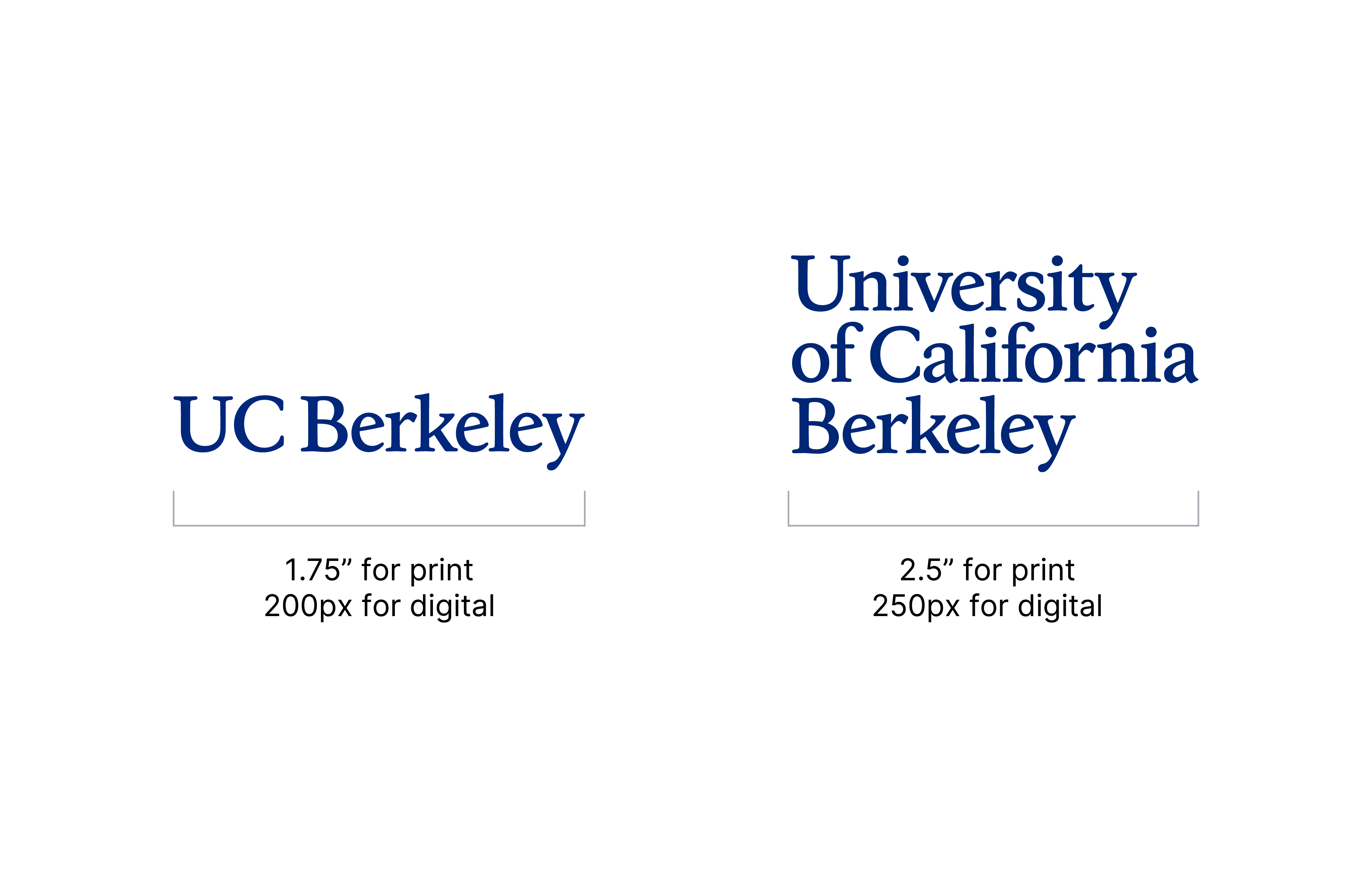
Minimum size
To maintain full legibility, for the primary logo, never reproduce the logo at widths smaller than 1.75 inches (for print) or 200 pixels (for digital). For the expanded logo, never reproduce the logo at widths smaller than 2.5 inches (for print) or 250 pixels (for digital). There is no maximum size limit but use discretion when sizing the logo. It should never be the most dominant element on the page, but instead should live comfortably and clearly as an identifying mark. Communications & Public Affairs is happy to consult and provide guidance.
Using the logo correctly
- Don’t skew or bend the logo in any way.
- Don’t stretch, condense or change the dimensions of the logo.
- Don’t add any extra elements to the logo.
- Don’t rearrange the placement of the type within the logo structure.
- Don’t alter or replace the typefaces within the logo.
- Don’t alter the placement or scale of the elements.
- Don’t use drop shadows, strokes or other visual effects.
- Don’t add colors to the individual elements.
- Don’t use colors other than those specified in the guidelines.
- Avoid the use of the Cal script for anything other than Athletics and alumni communications.