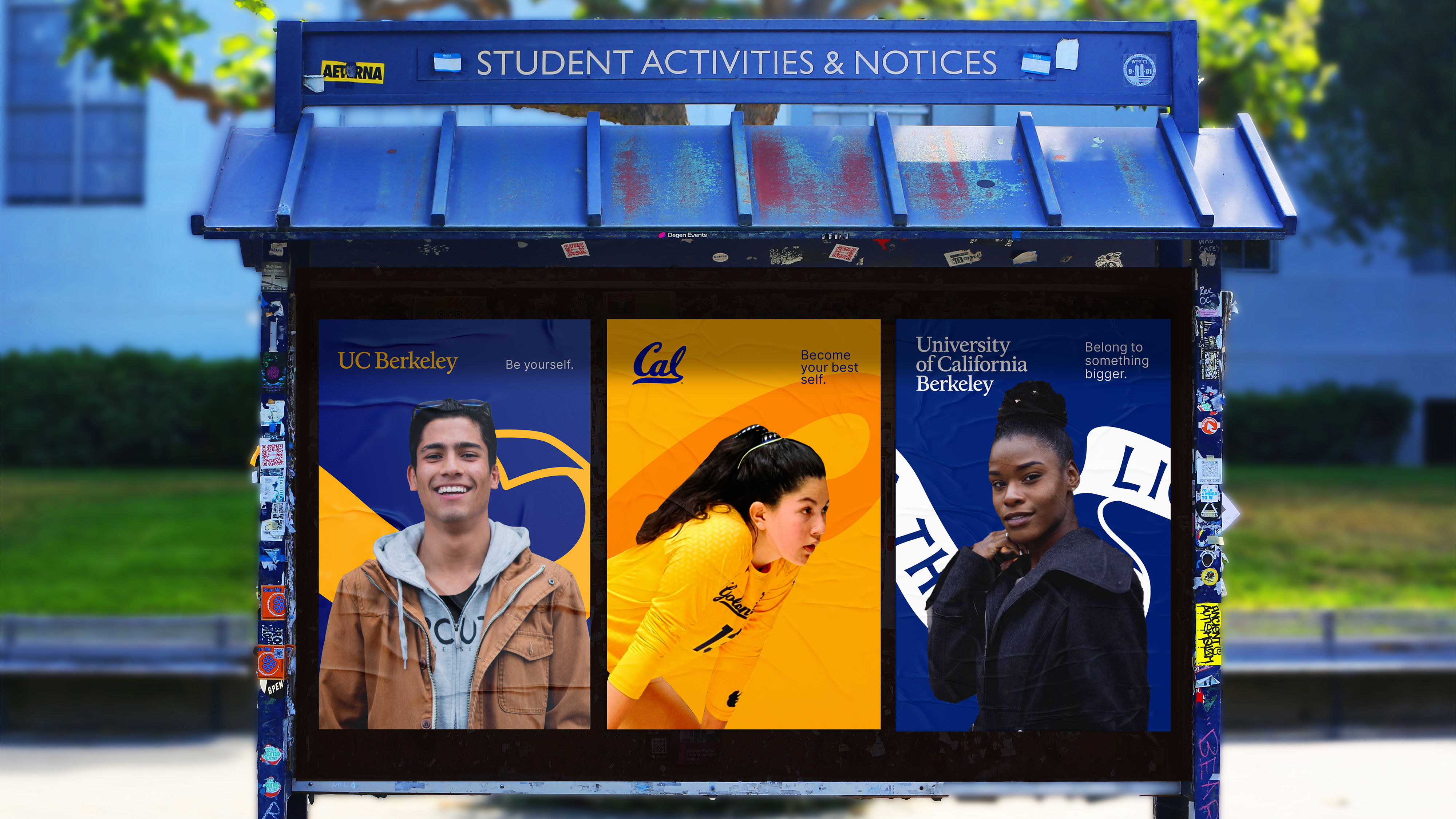
The UC Berkeley brand
UC Berkeley is one of the world’s most respected brands. As communicators, we are guardians of the brand. We work to ensure that no matter where our community members encounter our brand — a website, a newsletter or a public event — they are left with an impression that reflects our stature and ethos. On this site, you will find tools, templates and resources to help unify and strengthen our collective communications.
Our strategy
A brand strategy is a way for a brand to define how they want to be seen to the world. Our strategy is a result of a process that began with research and arrived at a clear positioning and messaging platform.

Development
To enhance our ability to tell the university’s story effectively, we have conducted extensive research, examining our brand and identifying opportunities for increased impact.

Positioning
Our positioning statement captures the unique benefits we offer and reflects the emotional response we evoke when people think of UC Berkeley.

Creative platform
Our creative platform helps us showcase our strengths, shape our voice and tone, and ensure consistency while allowing flexibility to adapt to different contexts and audiences.

Our visual identity
Our visual identity system spans our academic (UC Berkeley) and athletic (Cal) identities, and includes our logos, color palette, typography, photography style and graphic elements, creating a distinct visual language that is undeniably UC Berkeley — and that can be applied across audiences and contexts.

Logos
The UC Berkeley logo is our name set in a customized serif typeface that draws inspiration from the original metal version of the Californian typeface and other Frederic Goudy works. The Cal script mark is the primary logo for athletics.

Colors
Our color palette leads with a Berkeley Blue that has been brightened to better match the saturation of California Gold. An updated and simplified secondary color palette will complement our primary blue and gold.

Typography
The standard use of two new typefaces, Inter and Source Serif, will provide additional opportunities for visual connection. Both typefaces are released under open-source licenses and available for free through Google Fonts.

Brand essentials toolkit
This toolkit is your starting point for using the new UC Berkeley brand — access the graphic elements, color palette, color accessibility guide, and swatches all in one place. Our collective work is what builds the Berkeley brand, and our team is always available to help you do just that. If you have questions or feedback, our inboxes are open.
Share your work
We know that our campus communicators are producing amazing work, and we’re excited to see our community putting the new brand into action. Send us samples of your work and we’ll feature them on the brand site!