Ribbon
Our ribbon, which elevates our motto, “Let There Be Light,” may be used as a secondary graphic element to enhance communications. The ribbon must always be used in conjunction with the UC Berkeley wordmark and not in place of it. The ribbon should not be used in such a way as to infer it is the primary logo of the university.

Swish
When the ribbon is abstracted, it conveys a sense of dynamism and forward motion — or, as we call it, a “swish.” When paired with photography, the graphic element evokes a sense of forward motion — in other words, a pathway to opportunity.

Supergraphics

Seal Supergraphic

Ribbon Supergraphic #1

Ribbon Supergraphic #2
Iconography style
While other visual elements, such as photography, complement narratives and tell a story, iconography has a more functional purpose. Icons can enhance navigation and comprehension by quickly drawing attention to important messages and actions audiences should take. Icons help people understand, engage and take action with us. Icons are created with a stroke width of 3 pts.

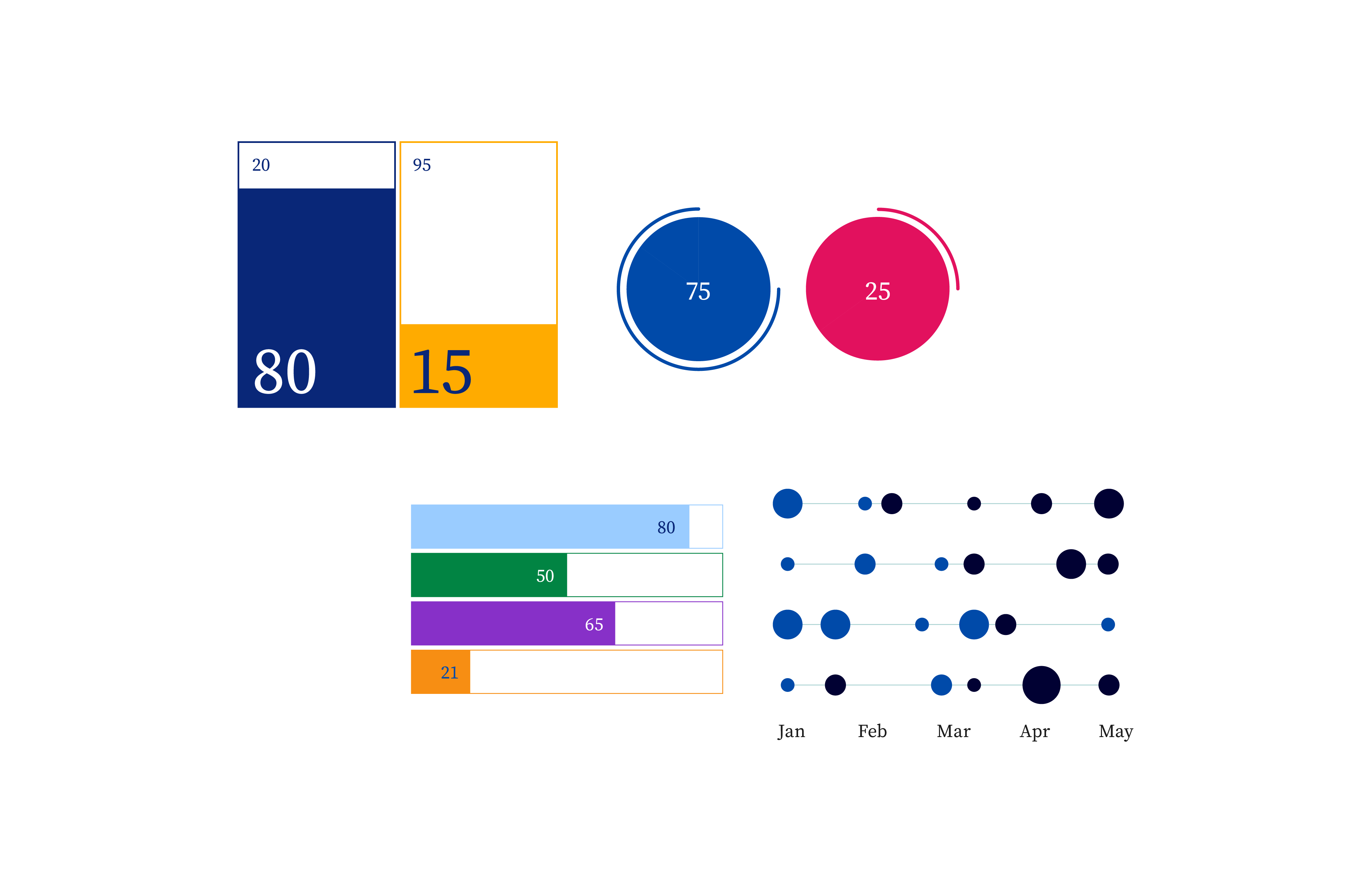
Data visualization style
Our data visualization employs color blocks to complement the logo and create a vibrant representation of our impact. Whenever possible, use our primary colors to emphasize the largest or most important data points, and use secondary/tertiary colors for smaller or less important data.

Illustration style
Illustration can be an effective storytelling device and can add dimension and dynamism to our visual expressions. Illustration, as a tool, has many applications, from print publications to environmental signage to digital activations. It can be especially powerful when photography and typography cannot sufficiently convey the full narrative. Illustration can be especially effective for editorial storytelling, when conveying abstract concepts or evoking a mood or tone. It should be considered alongside our other visual tools and deployed with intention, to maximize impact.
People-based illustration should reflect the vibrancy and diversity of our community in a simple, sophisticated, and authentic way.
Place-based illustrations should represent iconic landmarks on campus.
- Should not exaggerate the portrayal of the subject matter, a person or a thing, and never used for comic effect.
- Should always connect or relate to UC Berkeley — and its people, places and programs.
- Can be used across all media as a complement to the primary brand elements.
